
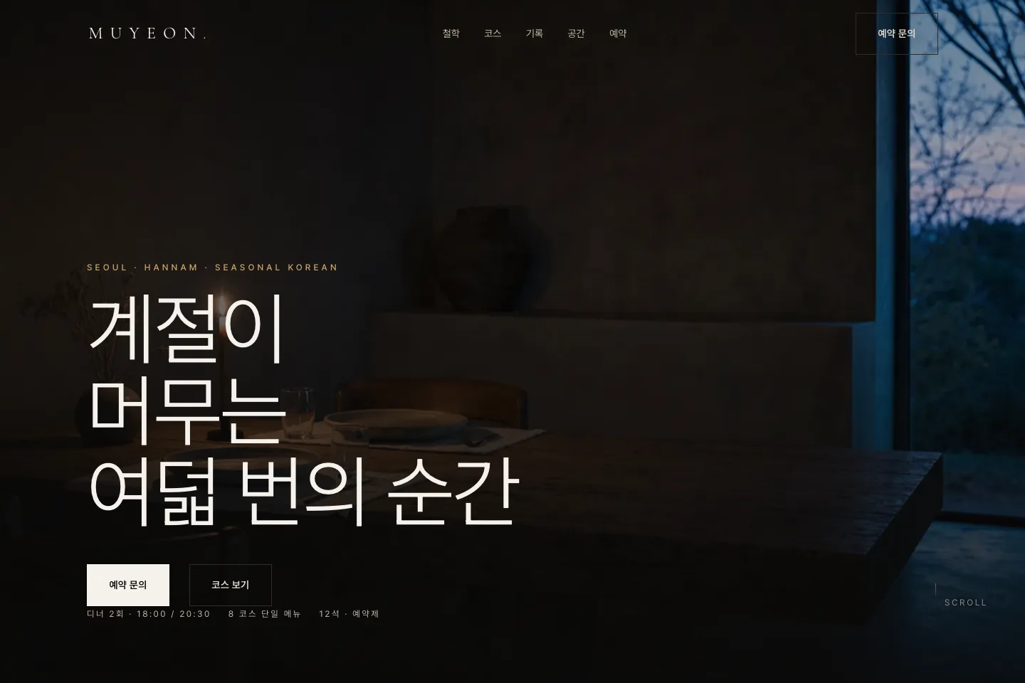
MUYEON — Dark Editorial Site for a Seasonal Korean Fine-Dining Room
A site for a twelve-seat seasonal Korean fine-dining room in Hannam, Seoul. Where fine-dining sites usually fail is simple: the more they explain, the less refined they feel. So this build had one rule — cut the sentences and let the photography and the empty space carry it.
The problem
A restaurant serving a single tasting menu cannot show you its menu; that week's ingredients are that week's courses. Which means the site is not selling dishes, it is selling how this kitchen handles a season. At the same time, reservations-only operation means the practical terms — days, sittings, seats, price — have to land without ambiguity.
Design approach
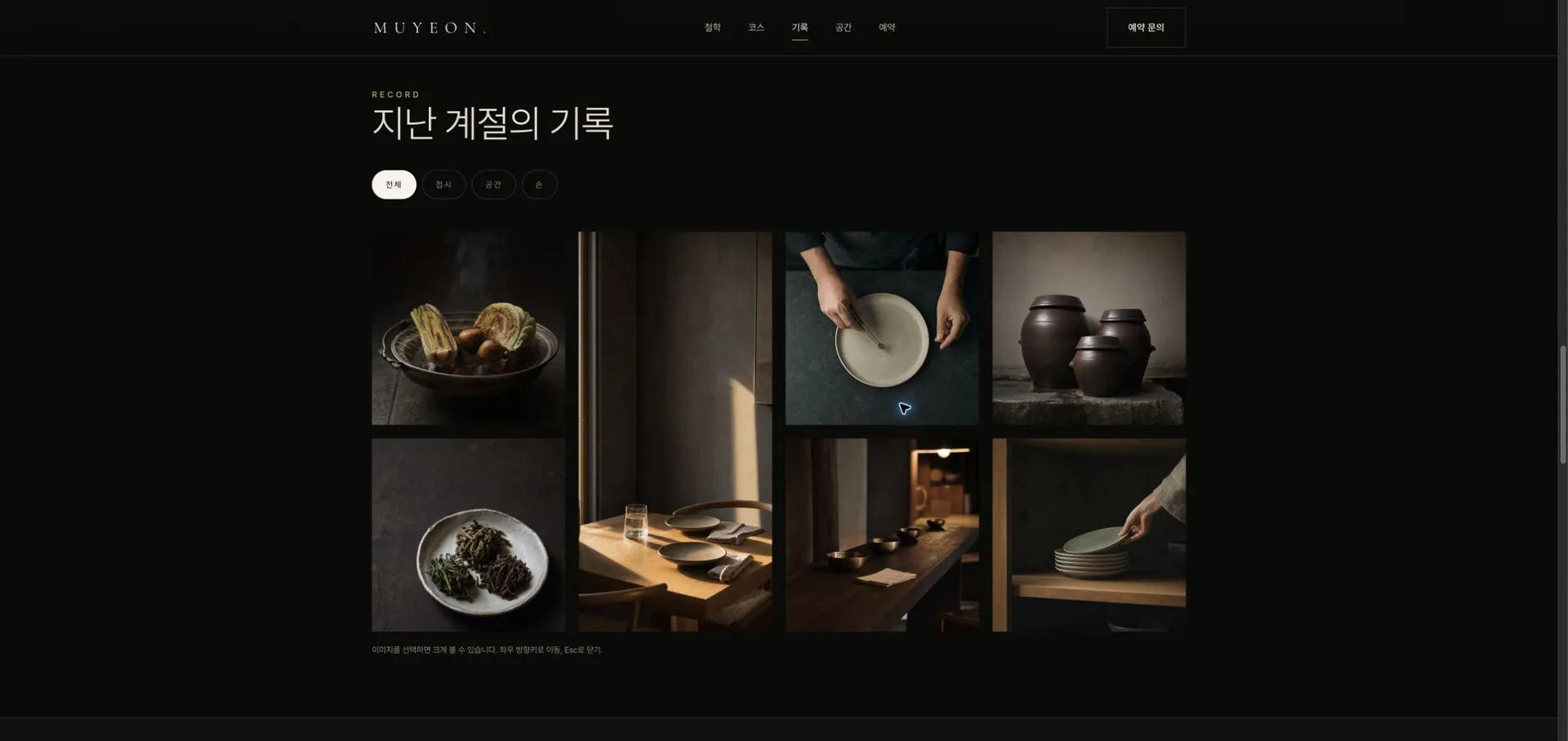
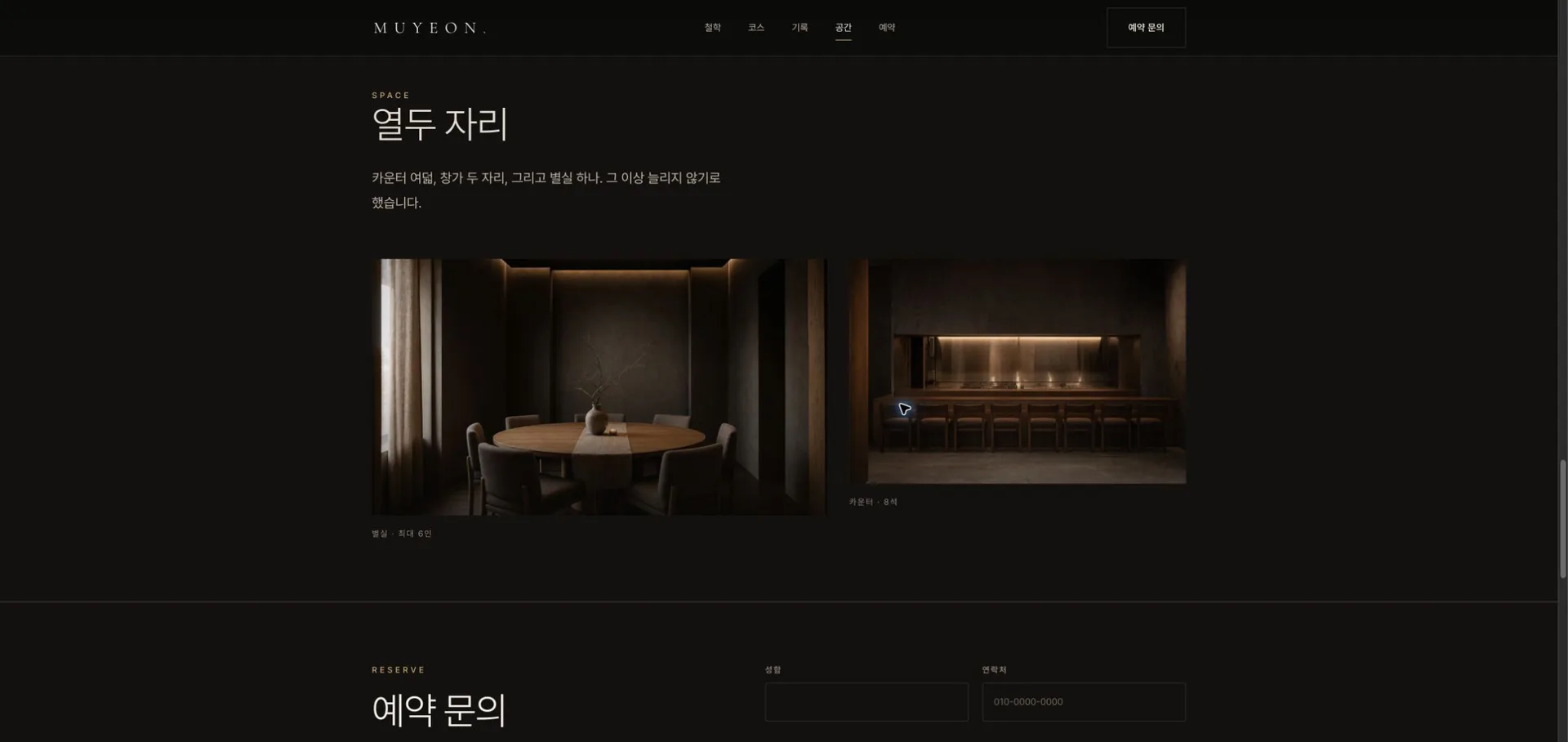
The palette is locked to three values: charcoal ground, warm clay body text, bronze accent. Pretendard for text, Cormorant Garamond 300 for display, so Korean and Latin read at the same weight. Every photograph carries the same gradient scrim, which makes eighteen images shot under different light read as one shoot. Copy holds to one sentence per screen.
Key interactions
- Pinned horizontal course rail — scrolling the page vertically moves the courses sideways. Track height is computed as viewport plus horizontal distance; JS writes only a progress value to a CSS variable, so the GPU does the moving. A progress bar fills alongside.
- Three-line mask reveal headline — the hero sentence rises line by line.
- Filter gallery with lightbox — three categories, arrow-key navigation, Esc to close, focus trapped inside.
- Parallax quote band — the background photograph drifts slowly against scroll position.
- Scroll-reveal choreography — IntersectionObserver with per-element stagger; photos settle out of a very slow push-in.
- Plus an infinite marquee, count-up figures, magnetic CTA, full-screen mobile nav, and a sticky reservation bar.
Technical build
- Zero-build static site — one HTML file, two stylesheets, one native ES module. No framework, no bundler, no dependencies. Deploys to Cloudflare Pages as-is.
- Images — all eighteen as WebP, 800KB total. Every
imgcarries width and height so there is no layout shift; only the hero loads eagerly. - Motion — transform and opacity only, with every scroll handler writing inside rAF. Under
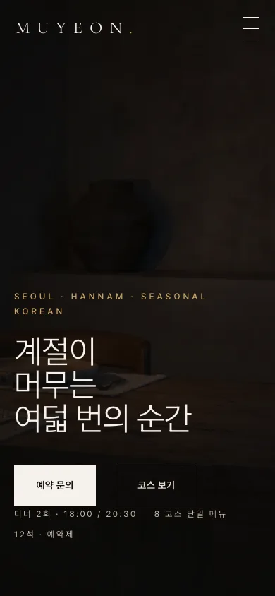
prefers-reduced-motionthe marquee stops, the pin releases into a horizontal snap scroller, and reveals appear instantly. - Accessibility — skip link, semantic landmarks, keyboard-operable gallery, lightbox, accordion and mobile nav, bronze focus ring. Worst-pixel contrast on the hero headline measures 4.81 desktop and 12.26 mobile, above the WCAG AA threshold of 4.5.
- Security and SEO — four security response headers, a one-year immutable cache on static assets, Restaurant JSON-LD, Open Graph and Twitter card metadata.
Live
Live demo: ononc-muyeon-dining.pages.dev
This is a fictional brand demo built to show ononc's production quality. It is not a real business, and the reservation form does not send anything. The photography was generated for this demo brand with AI; the site footer states that no real people or places are depicted.