
NEXTSTEP Academy — a cram-school site that argues with data
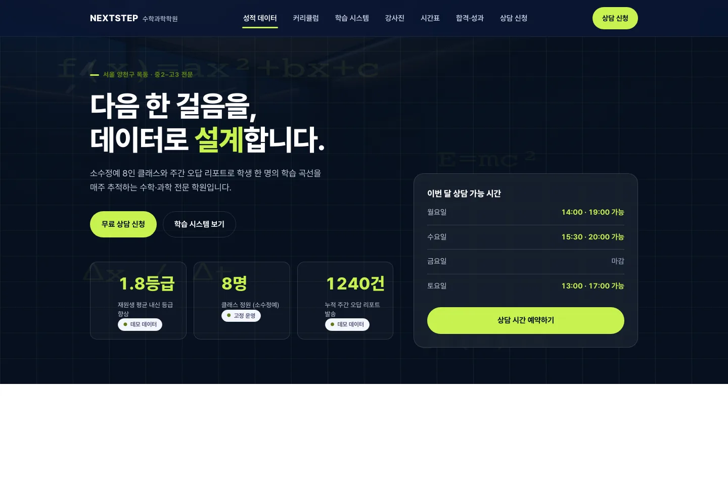
A site for a maths and science academy serving grades 8–12. The real visitor to a cram-school site is not the student but the parent who signs the cheque, and they are checking exactly two things: do grades actually improve here, and does the timetable fit our child.
The problem
Most academy sites open with a principal's greeting and a banner slider, then bury the timetable and the consultation form at the very bottom. This one inverts the order: performance data → curriculum → learning system → timetable → consultation, stacking the evidence a decision needs before asking for anything.
Design approach
Deep navy with a signal-lime accent, and every figure typeset with tabular numerals. The goal was the information density of a SaaS product page instead of the usual decorative clutter. No student faces are used anywhere — a portrait-rights decision — and the instructor portraits are AI-generated images made for this demo brand rather than photographs of real people (disclosed in the site footer). The header dropped its square initial lettermark and keeps the wordmark alone; an initial inside a small rounded square is the single most common way an academy site looks cheap.
Signature interactions
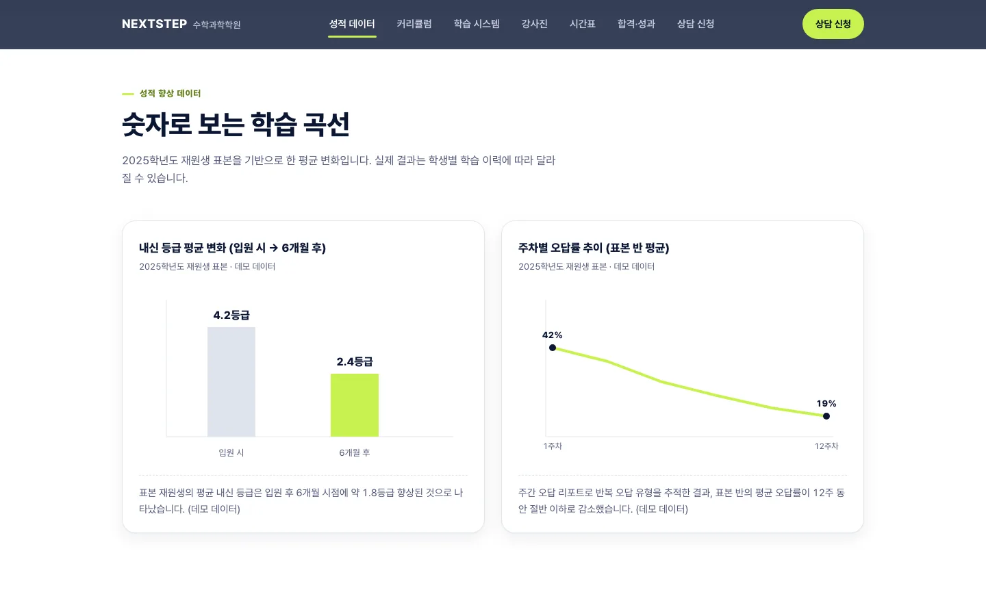
- Charts that draw on scroll — a grade-change bar chart and a twelve-week error-rate line chart, both hand-authored inline SVG. Every figure carries a "demo data" caption so nothing can be mistaken for real results.
- Per-grade curriculum tabs — five tabs from grade 8 to grade 12, implemented as a role=tablist with arrow-key navigation, each holding sessions per week, materials and assessment method.
- Responsive timetable — a day × time grid on desktop that reflows into a card list on mobile, with a grade filter that highlights only the relevant classes.
- KPI count-up — headline metrics count up as they enter the viewport, and render at their final value immediately under reduced motion.
- Consultation form — grade, subject and preferred time slot, with inline error messages wired through aria-describedby.

Designing for conversion
The consultation button is pinned in the header at every scroll position, and a "consultation slots open this month" card sits beside the hero to lower the threshold for getting in touch. On mobile, the full-screen overlay navigation traps focus while open.

Engineering, performance, accessibility
- Build-free static site — plain HTML, CSS and vanilla JS. With no framework or bundler, the deployed output is the source, so nothing can rot at maintenance time.
- Deployed on Cloudflare Pages — served from the edge, with a
_headersfile applying security headers (X-Content-Type-Options, Referrer-Policy, X-Frame-Options, Permissions-Policy) and a one-year immutable cache for static assets. Unknown paths return a branded 404 page with a real 404 status. - Images — everything converted to WebP, every
imgcarrying explicit width/height so there is no layout shift. The hero loads eagerly, everything else lazily. - Motion — animations touch only transform and opacity so they stay on the compositor, and every auto-playing motion stops under
prefers-reduced-motion. - Accessibility — skip link, semantic landmarks, keyboard-operable tabs, lightbox and mobile navigation, visible focus rings, live regions for form status, and WCAG AA contrast.
- SEO — title, description, canonical, Open Graph, Twitter card and vertical-appropriate JSON-LD structured data.
Result
Live demo: ononc-nextstep-academy.pages.dev
This is a fictional-brand demo built by ononc to show production quality. It is not a real business, and the inquiry forms do not send anything. The photography is generative-AI imagery created for this fictional brand; the site footer states that no real people or places are depicted.