ONONC UI — A motion-first React component library
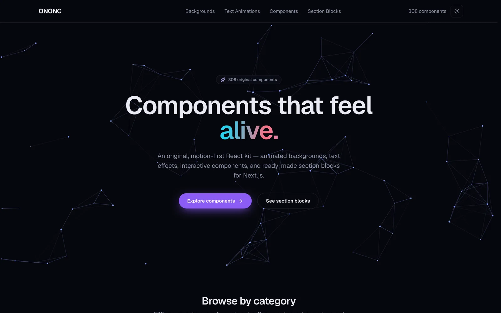
ONONC is a motion-first React component library, built from scratch around one idea: interfaces that feel alive. Animated backgrounds, text effects, interactive components, and drop-in section blocks — over 300 original components, unified under a single design language on top of Next.js 16 and React 19.
Why we built it
Most UI kits are well made, yet they tend to look alike and sit still. Buttons only click; backgrounds just wait. We wanted a set where motion is the default, not the exception — surfaces that react to the cursor, reveal on scroll, and respond naturally to touch.
So instead of borrowing someone else’s look, we drew a component set with its own brand palette and motion language from the ground up. ONONC is the result — and the “living toolbox” we reach for on real projects every day.
What’s inside
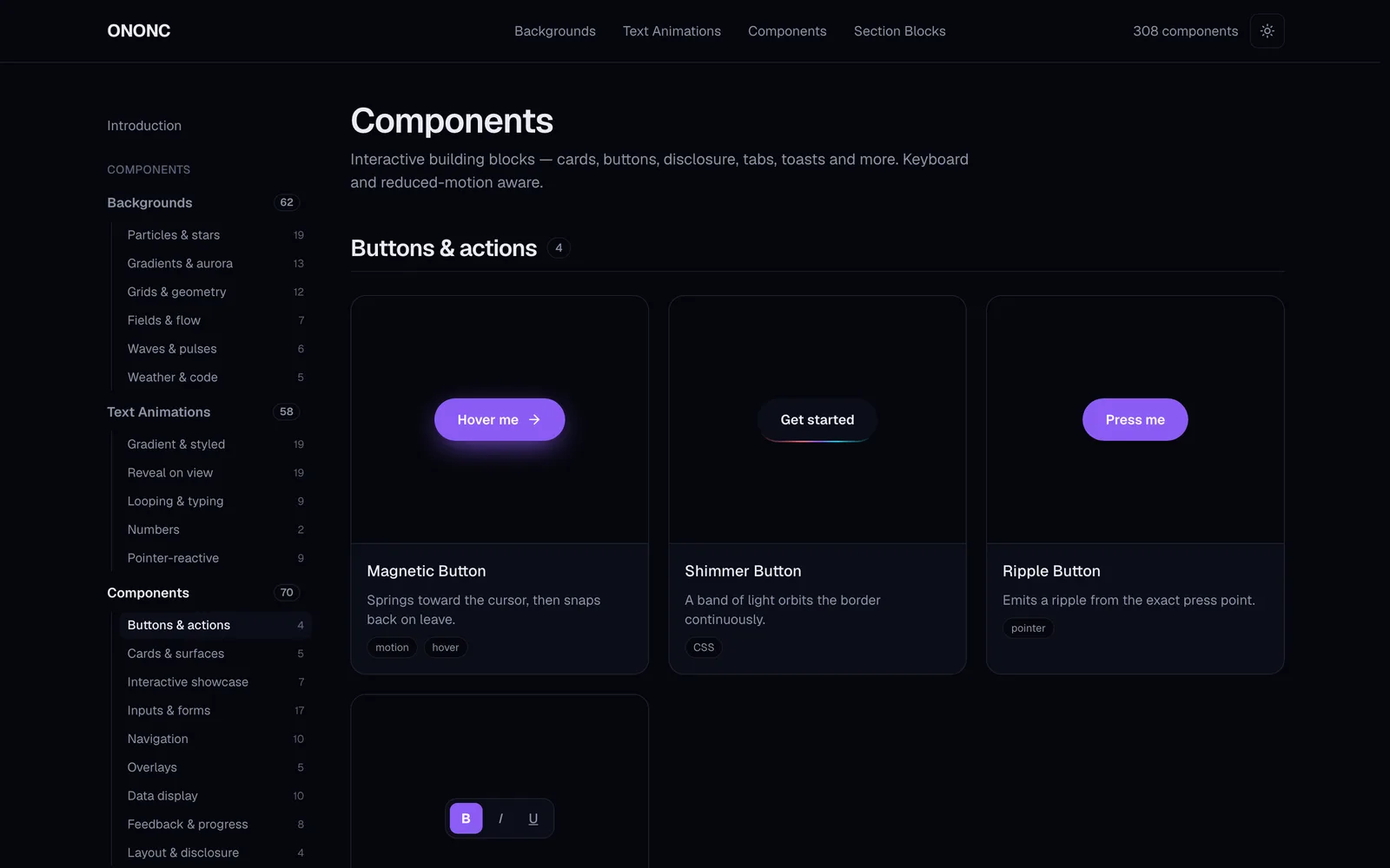
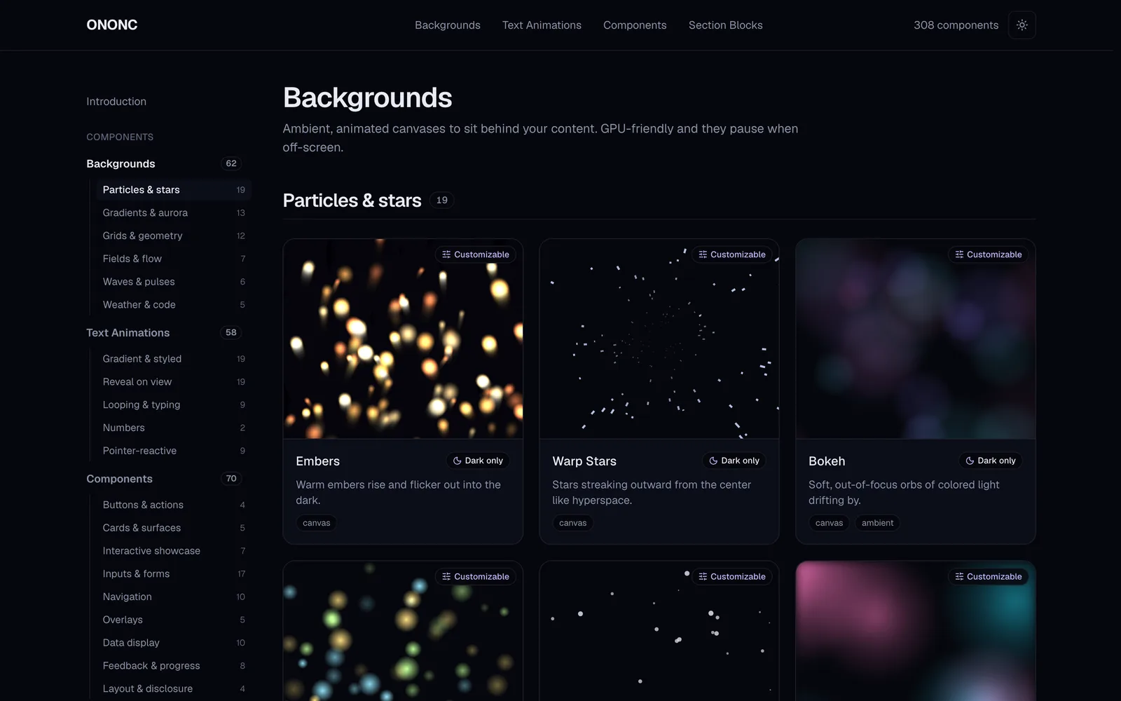
ONONC is organized into four families, and every component is built to be copied on its own, with no tangled dependencies.
- Animated backgrounds — GPU-friendly canvases that sit behind your content and pause themselves when off-screen or when the tab is hidden, to save battery.
- Text animations — gradients, typing, decoding and more, with semantic markup and ARIA preserved so they stay screen-reader friendly.
- Interactive components — buttons, cards, overlays, forms and beyond, with pointer reactivity plus full keyboard support and reduced-motion awareness.
- Section blocks — hero, pricing, timeline, footer and other ready-to-drop sections that compose a page in minutes.
How it’s built
Dark-first design tokens
Every color comes from design tokens defined as CSS variables. Dark is the default, with light mode fully supported, so each component speaks the same color language.
Animation with performance in mind
Canvas animations render through requestAnimationFrame, pause via IntersectionObserver when off-screen, and cap the device pixel ratio so high-density displays stay smooth. The rule: expressive, never heavy.
Accessibility is not optional
All motion honors prefers-reduced-motion and eases off gracefully, and interactive components are fully operable by keyboard. Animation never gets in the way of the message.
Source you can copy
Each component’s real source lives in the site’s Code tab. Nothing is locked inside a heavy package — copy just the files you need and adapt them freely.
A playground you can touch
Every component has a detail page with preview and code tabs, desktop / tablet / mobile viewport presets, and a live Customize panel alongside a props table. You can even share a tweaked state by URL, so a setup travels with the link.
The finished showcase is built as a static site and deployed on the edge, so it loads fast anywhere. Try it live below.