
The Order of Building a Website with AI: Design, Images, Video, Code
Ask an AI tool to “make me a good website” and a screen appears almost immediately. The problem is that the screen usually belongs to no one. The colors are inoffensive, the spacing is fine, and nothing tells the visitor what to read first. That is not a tooling failure. It is a sequencing failure.
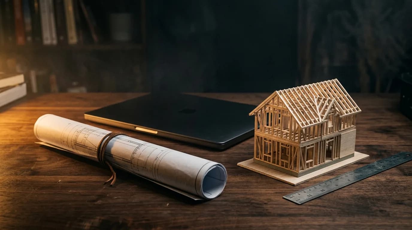
Design, photography, video, and code can all be generated now. Which makes the order in which you lock things down the thing that separates a site that works from a site that merely renders. What follows is a production sequence that treats a website the way a builder treats a house — and it holds regardless of which specific tools you use.
AI gives you speed. It does not give you sequence.
1. Finish the design before anything becomes code
The first decision creates the largest gap. Instead of asking a coding agent to build something, finish one screen completely in a design tool first. There is not much to settle: a reference width, a twelve-column grid, one or two typefaces for headings and body, and the overall tonal range.
If you are going dark, a near-black with a trace of color in it reads with more depth on screen than pure black. Details like a large headline passing behind the hero image, or a gradient blur that softens only the bottom edge, also belong to this stage. An AI will not invent these unprompted. Decide them once, and every section afterwards inherits the same rules.
2. When the client has no photography, generate the scene
In practice, the thing that stalls a build is rarely the design. It is the source material. The company is new, or the site photos exist but are not usable on the web. Stock imagery used to fill that hole. Generating the exact scene you need is now far more precise.
Put four things in the prompt: what sits at the center of the frame, the time and place, where the light comes from, and the mood of the finish. “Night site, a large excavator centered, a completed house behind it, light haze, cinematic” produces a scene that belongs to that company specifically. It is also worth running the same prompt through two or three image models at once and comparing the results side by side — each interprets the brief differently, which widens what you get to choose from.
On a public site, though, make sure generated imagery is never mistaken for a record of completed work. Concept images stay in concept positions; the project pages carry real photographs.
3. Three routes from design into code
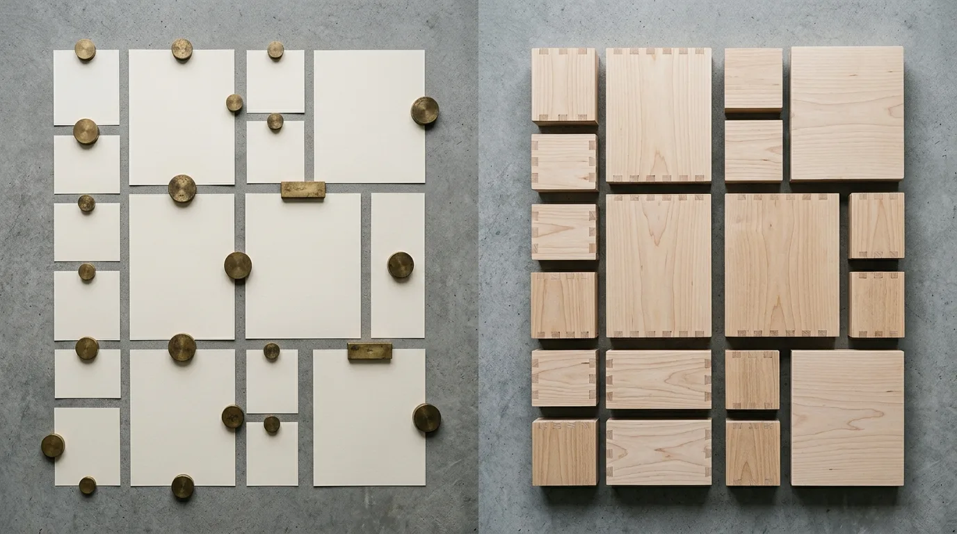
There are broadly three ways to hand a finished design to a coding agent. Each one leaves less for a person to fill back in.
- Hand over an image — export the whole screen and pass it along. Typefaces and sizes get filled in by inference, and assets like the logo and photography have to be exported separately. The advantage is that it works with any toolchain.
- Hand over the dev-mode prompt — the design tool can turn a selected frame into a prompt written for coding agents. Pasting that in carries the layout structure and asset references with it, which removes some of the guessing.
- Connect the design file directly over MCP — instead of handing over a capture, let the agent open the design file itself. This is currently the most accurate route.
What changes once Figma MCP is connected
MCP (Model Context Protocol) is the standard that lets a coding agent operate external tools directly. Figma ships an official server for it, and the major coding tools — Claude Code among them — can connect. Setup is a single line.
claude mcp add --transport http figma https://mcp.figma.com/mcpThat remote server works without the Figma desktop app and is available on every plan. If policy requires everything to stay local, you can connect the server the desktop app exposes instead — that one needs a Dev or Full seat on a paid plan.
Using it comes down to one link. Right-click the frame you want in Figma, choose Copy link to selection, paste the URL, and say what you want built.
Implement the hero section at this link. Reuse the existing components under src/components/ui, and map the colors and spacing to CSS variables using the Figma variable names as-is.
Behind that one sentence, the agent queries the file repeatedly: get_design_context for layout structure and a code representation, get_variable_defs for the color, spacing, and type variables, get_screenshot for a visual to check against, and download_assets for the original icons and photography. The screen gets built from real values rather than from “roughly this size.”
Three differences show up in practice.
- Spacing and sizing stop being guesses — a 24px gap arrives as 24px. There is noticeably less to correct on the first build.
- Design variables become tokens — the color names chosen in design connect to the variable names in code, so changing the tone later means editing one place.
- Existing components get reused — point at a folder and the agent stops rebuilding a button you already have. Pairing design components with code components through Code Connect makes this sharper still.
Check the limits before you plan around it. On a free plan, or with a View or Collab seat, tool calls are capped at six per month; Dev and Full seats on paid plans get per-minute limits with far more headroom. Moving even a single screen takes several calls, so sort out seats before committing this to a real project.
One more thing: connecting MCP is not an invitation to hand over an entire site at once. Moving one frame or one section at a time, checking each, ends up being faster.
Whichever route you take, the first build is not the finished thing. The reference width can be off so the layout spreads awkwardly on wide screens, or border weights come through heavier than designed. It is still a good starting point, because what remains is correction rather than creation.
4. Describe motion in the language of the screen
What makes an impression on a modern site is usually a scroll-linked section. For a section that walks through a process, you can pin the whole viewport when the visitor arrives and let the scroll itself drive playback.
Asking for “something cool that animates” produces a different answer every time. Write the conditions down instead.
Make this section one viewport tall, and map scroll progress from 0% to 100% directly onto the start and end of the video. The heading and progress bar stay pinned until playback finishes.
That usually lands on the first attempt. Height, whether it pins, and the mapping between scroll progress and playback position — with those three in the instruction, there is little left to guess.
5. Pieces made separately do not connect
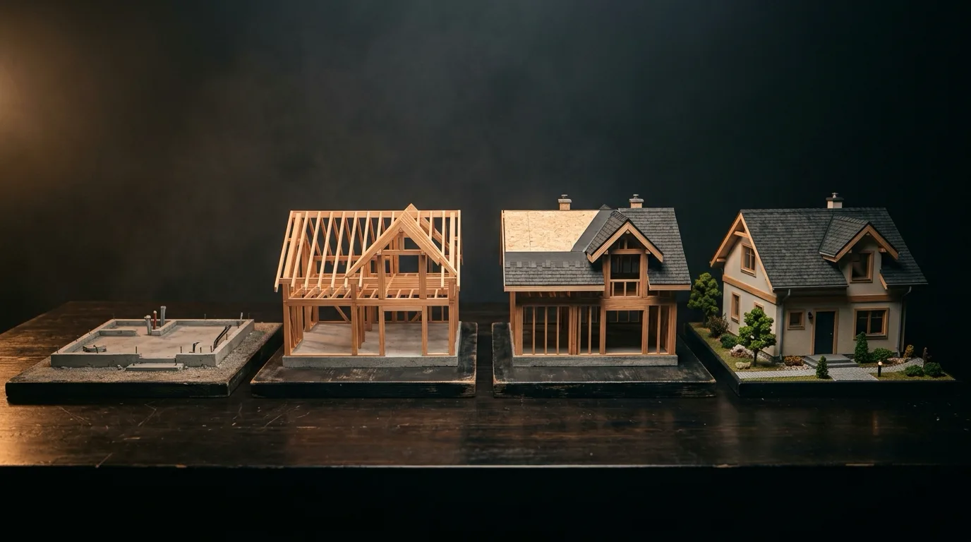
Here is where these builds actually fail. To show four construction stages, you generate four separate clips. Each one looks good on its own. Then you play them in sequence: the windows move, the roofline changes, and the final frame is missing what it was supposed to arrive at. Each clip imagined a slightly different house.
The fix is to invert the order. Decide what the finished state looks like, then generate one long piece against that reference. A single twenty-second render, five seconds per stage, with the instruction that the last frame must match the finished image you already have. The same building survives from beginning to end, and you know in advance where it lands.
This is not a video-only rule. It applies to image sets, to voice across pages, to layout across sections. Fix the ending and the middle stops drifting.
6. Whatever the AI produced is a draft
As design and implementation get faster, the final review carries more weight, not less. At minimum, a person should check the following before launch.
- How it actually behaves on a phone — whether headlines break awkwardly on narrow screens, and whether pinned sections still feel natural under a thumb.
- The weight of video and images — for scroll-linked video, file size matters more than resolution. One heavy hero image slows down the entire first impression, and what speed does to revenue is more direct than most teams expect.
- Alt text and keyboard navigation — generated images do not describe themselves. Someone has to write what the scene contains.
- Factual claims — numbers, project history, and credentials never ship as generated. Check them against the source.
The sequence is the quality
Finish the design first, generate the material you do not have, hand a completed screen to the code, specify motion as conditions, and fix the final frame before producing anything continuous. Follow those five and an AI-built site stops reading as something made quickly and starts reading as something made properly.
ononc designs and builds brand sites in exactly this order. Having no photography or video yet is not a problem — we start by working out which scenes you actually need. Tell us where you are on the project inquiry page.
More posts

"Pacing the Frontier": Why Sam Altman and Dario Amodei Agreed to Slow Down AI
The global technology landscape is experiencing a paradigm shift that few saw coming just months ago. Led by Anthropic CEO Dario Amodei and OpenAI CEO Sam Altma…
Six Things That Must Stay in Your Name When Someone Else Builds Your Website
Nobody thinks about it while the site is running fine. It surfaces the day you part ways with whoever built it. Domain, DNS, deployment, source code, analytics, licences — here is how to check, in five minutes, that all six are in your name.
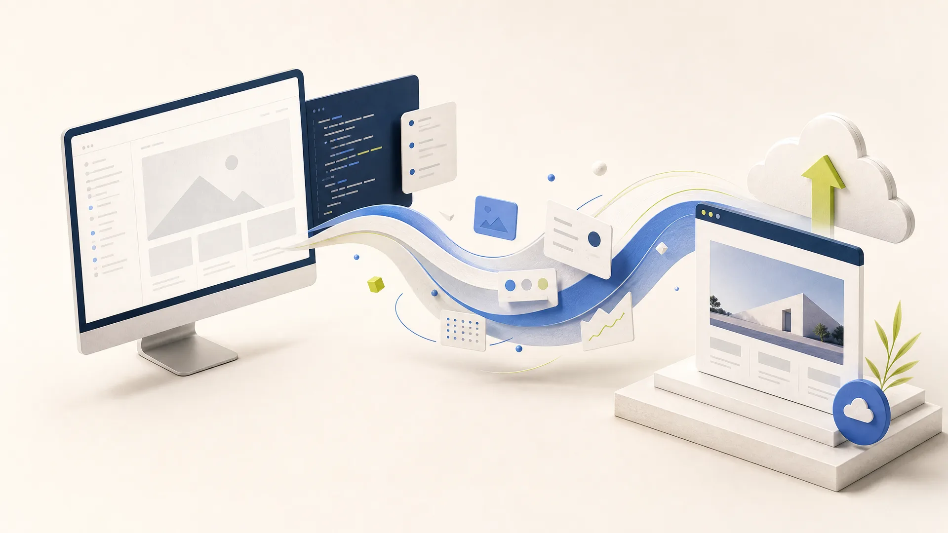
7 Principles That Matter More Than Speed When Building and Deploying a Website with AI
AI can accelerate website production, but good outcomes require more than a well-written prompt. This practical seven-step guide explains how to define a brief, build in small units, validate in preview, and release with operational discipline.